Byron's Mead Labels
Mead Label
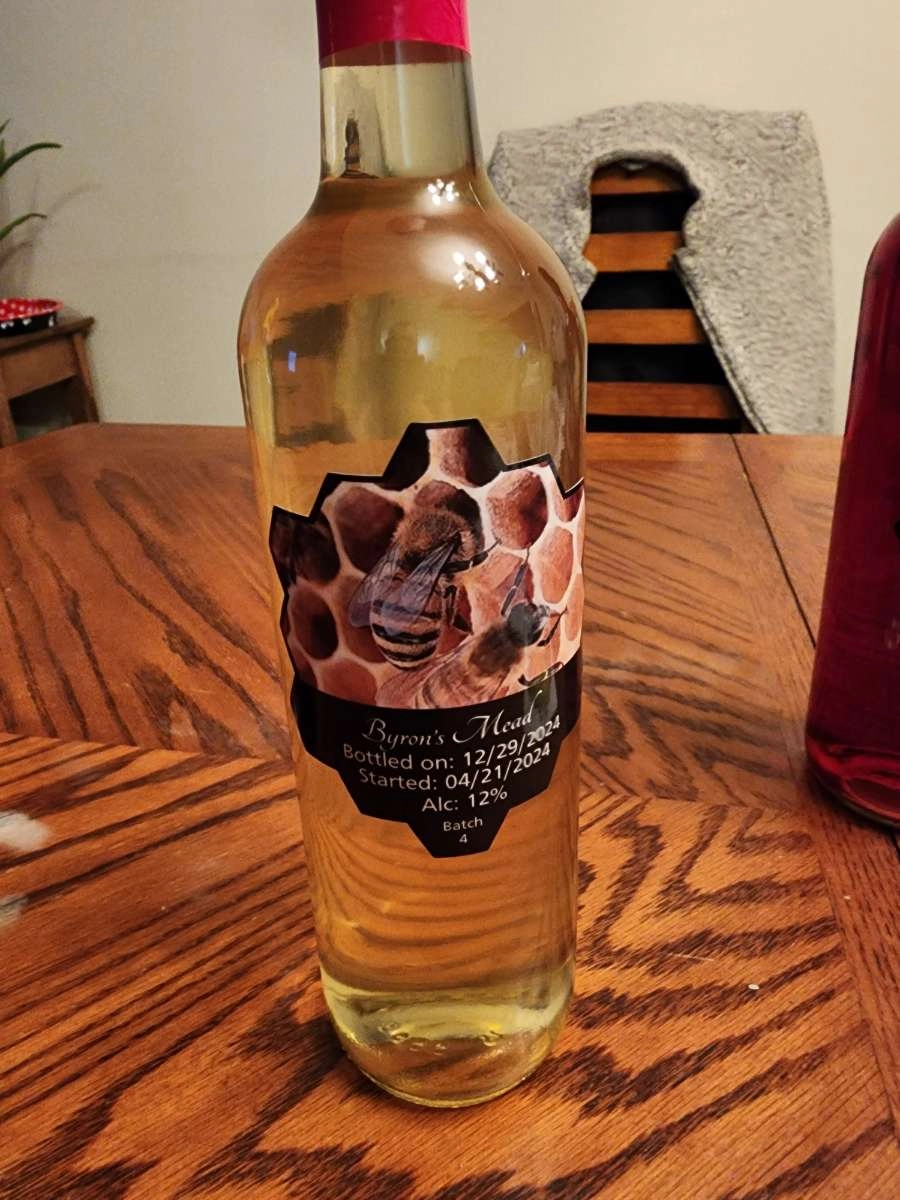
This label is the Mead Label. I was given an old label to use as reference which is where I got the honeycomb dieline and the bee image for the main background.
Melomel Label
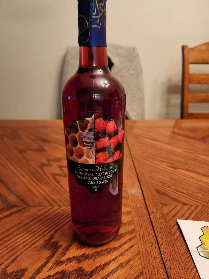
This is the Melomel label.
I used the same bee image (gotten from unsplash with a free commerical use liscence) and merged it with a raspberry image from the same source. Since Melomel is essentially mead with the addition of fruit to the process, I think this easy solution works effectively. Not to mention the Raspberry red works really well against the red colour of the Melomel drink.
I used the same bee image (gotten from unsplash with a free commerical use liscence) and merged it with a raspberry image from the same source. Since Melomel is essentially mead with the addition of fruit to the process, I think this easy solution works effectively. Not to mention the Raspberry red works really well against the red colour of the Melomel drink.
Wine labels
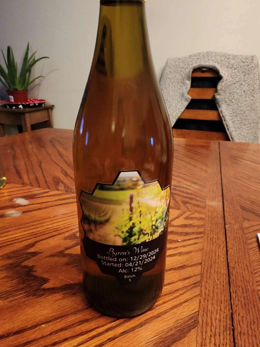
This is the first wine label.
I used a vineyard image (gotten from unsplash with a free commerical use liscence) to represent the time and care that went into making this product. I wanted to stay away from something more elegant and modern as to not give the person looking to buy this product that it was made in a factory or with some sub par ingredients. The use of this vineyard gives the viewer the idea that the ingredients are grown from the ground and the process is how it should be. This is the same reason for using the script style font for "Byron's Mead" and not something like monsterrat. I used a sans-serif font for the description text to increase legibility as this was a concern.
I used a vineyard image (gotten from unsplash with a free commerical use liscence) to represent the time and care that went into making this product. I wanted to stay away from something more elegant and modern as to not give the person looking to buy this product that it was made in a factory or with some sub par ingredients. The use of this vineyard gives the viewer the idea that the ingredients are grown from the ground and the process is how it should be. This is the same reason for using the script style font for "Byron's Mead" and not something like monsterrat. I used a sans-serif font for the description text to increase legibility as this was a concern.
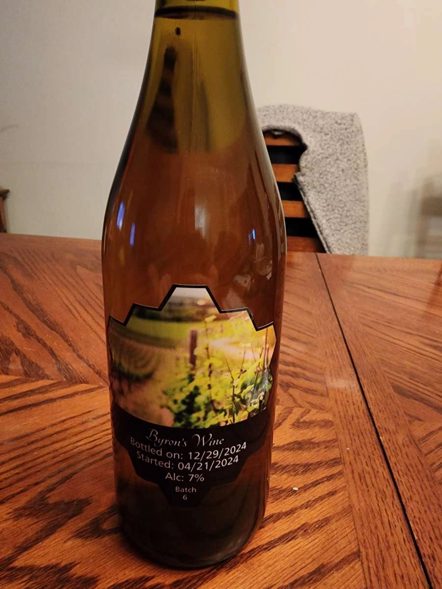
This is the second wine label.
The only difference between the first and second wine labels are the alcohol content. Other than that they are the same label.
The only difference between the first and second wine labels are the alcohol content. Other than that they are the same label.